
IMPROVING THE UX OF THE CHURCH MOBILE APP FOR BETTER ENGAGEMENT
The church app had usability challenges that made it difficult for users to navigate sermons, register for events, and complete donations, leading to lower engagement and frustration. Through user research, usability testing, and a mobile-first redesign, I streamlined the app’s navigation, improved content accessibility, and optimized the giving and event registration experience.
The result? A 50% improvement in navigation efficiency, 60% more event sign-ups, and a 40% increase in sermon engagement. 🚀
PROJECT OVERVIEW
Problem:
Church members struggled with the mobile app experience, particularly in navigating sermons, livestreams, and event registrations. Feedback showed that users found it confusing and cluttered, leading to lower engagement and frustration.
Goal:
Redesign the app to:
✅ Improve navigation clarity for sermons, livestreams, and events
✅ Enhance the mobile user experience
✅ Simplify the donation and event registration process
✅ Make content more accessible and engaging
My Role:
Lead UX Designer – responsible for user research, wireframing, UI/UX design, and usability testing
Tools Used:
🛠 Subsplash
RESEARCH & DISCOVERY
To ensure our church website provided the best possible user experience, I conducted a competitive analysis of other modern church websites. This helped identify best practices, UX trends, and common user pain points that we could apply or improve upon.
Church Websites Analysed:
I reviewed multiple church websites, including:
Mariners Church
HTB Church
Elevation Church
Key UX Trends Identified:
🔹 Simple, Clean Navigation – Many churches used a clear, structured menu for easy access to sermons, events, and giving.
🔹 Mobile-Optimized Layouts – Most sites were designed mobile-first, ensuring seamless browsing on all devices.
🔹 Engaging Visuals & Videos – Churches emphasized high-quality imagery and video content to create a welcoming feel.
🔹 Streamlined Event Registration – The best websites featured one-click event registration with minimal form fields.
🔹 Giving Experience Optimization – Donation pages used simple CTAs and multiple payment options to encourage contributions.
Findings & Insights:
💡 Our website needed a simplified navigation bar with easy access to livestreams and events.
💡 Implementing large, visual call-to-action buttons would improve engagement.
💡 The giving process needed streamlining—reducing steps and adding more payment options.
💡 A mobile-first approach was essential, as over 70% of users accessed the website on mobile devices.
How These Findings Shaped Our Redesign:
✅ We redesigned the homepage to highlight sermons, events, and livestreams more prominently.
✅ Navigation was simplified with clear menu items and sections.
✅ The event registration process was streamlined to reduce user friction.
✅ We used bold imagery and engaging typography to make the website feel more dynamic and inviting.

FINAL DESIGN & IMPACT

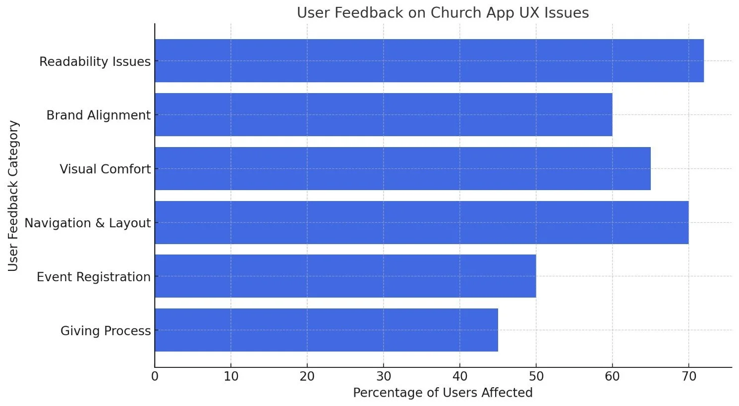
The Church App UX Redesign focused on improving readability, navigation, branding alignment, and content accessibility to create a more engaging and seamless user experience. Based on user feedback, we implemented several design and functional upgrades, ensuring that members could easily interact with sermons, events, and giving features.
🔹 Key Improvements:
📌 Enhanced Readability & Typography
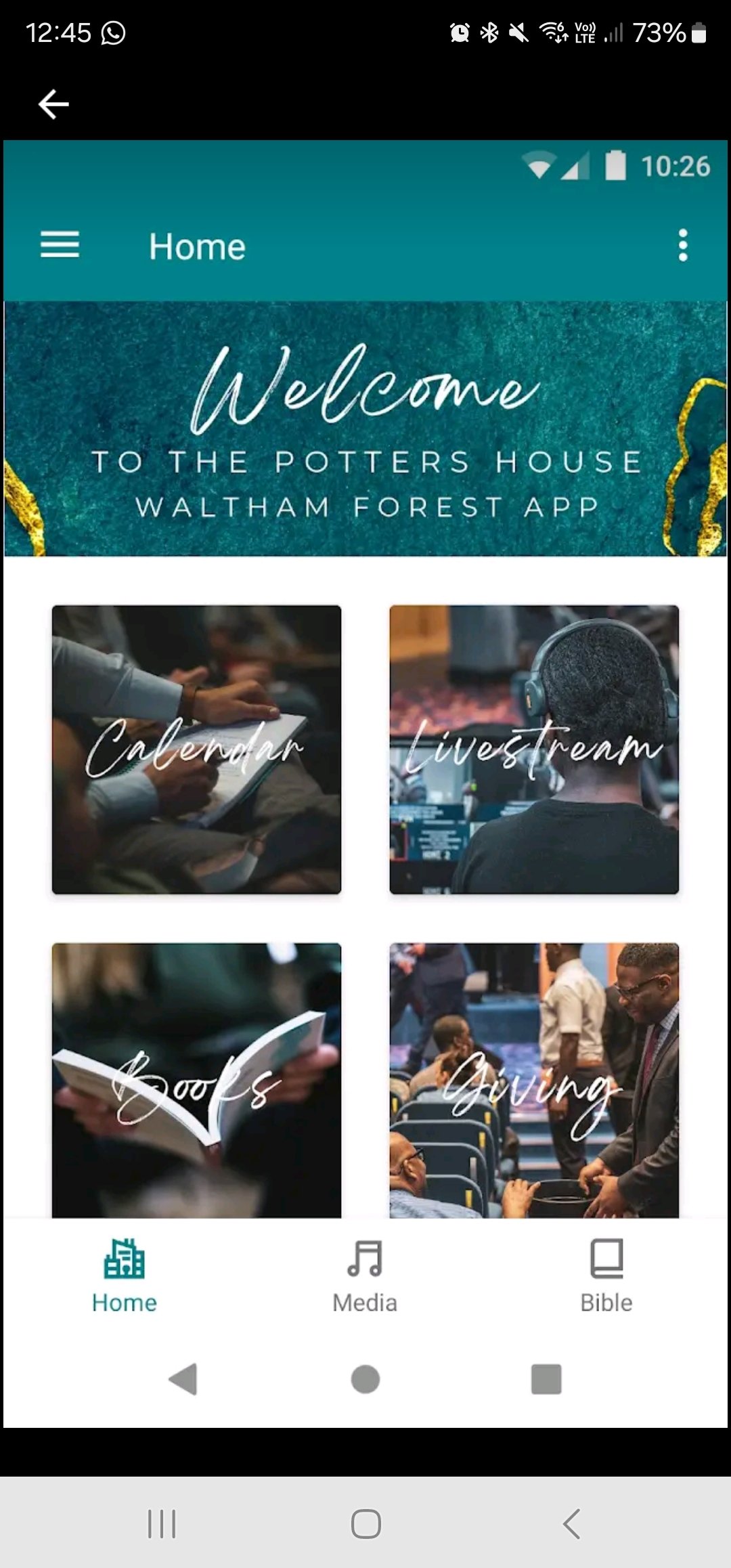
Before: Users struggled with cursive fonts that made content hard to read.
After: Clean, modern sans-serif fonts were introduced, improving legibility across all devices.
📌 Stronger Brand Identity & Visual Consistency
Before: The app’s colors didn’t align with the church’s branding, and the UI felt disconnected.
After: We implemented a cohesive color scheme, aligning with the church’s visual identity while maintaining a visually balanced, dark mode-friendly interface.
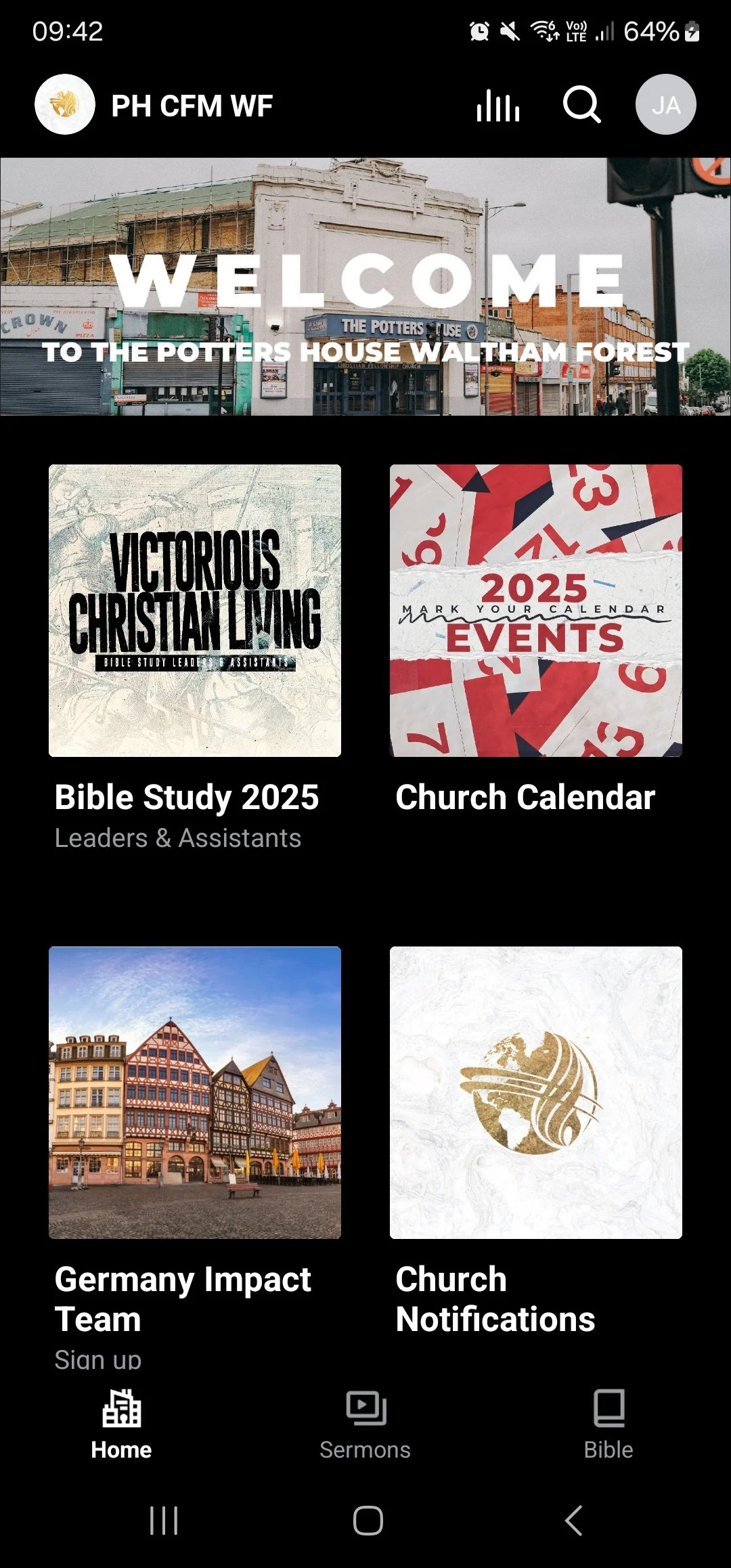
📌 Optimized Layout & Navigation
Before: Large tile-based designs cluttered the interface, making navigation confusing.
After: The layout was refined into a structured card-based design, allowing users to find sermons, events, and Bible study resources more easily.
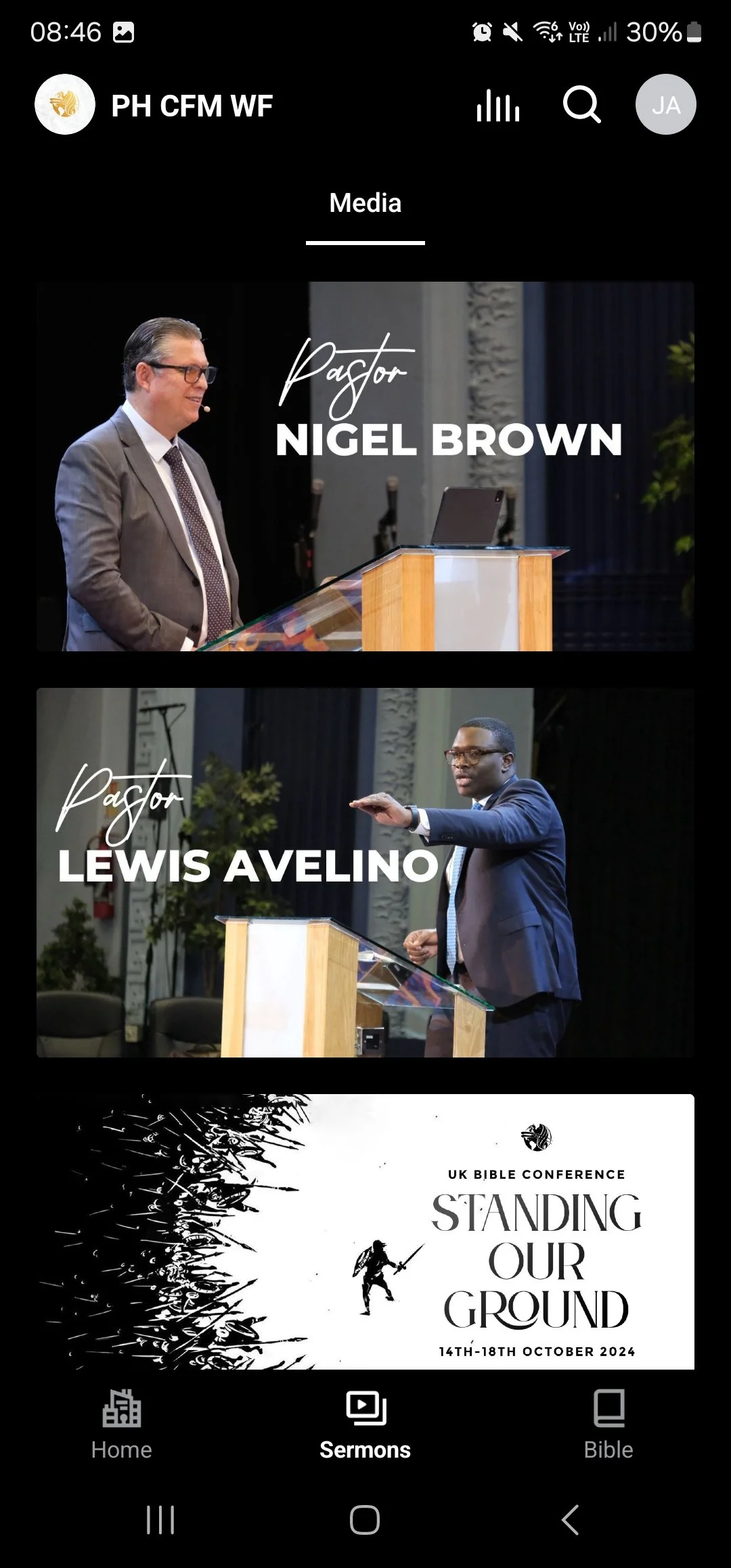
📌 Improved Sermon Discovery & Engagement
Before: Finding past sermons was a challenge due to poor categorization and inconsistent UI elements.
After: A dedicated Sermons section with clear titles, speaker information, and high-quality thumbnails makes it easier to browse and engage with content.
📌 Streamlined Event & Notification System
Before: Event registration was hidden and difficult to access.
After: The new Church Calendar & Notifications section makes it easy to sign up for events and stay updated on church activities.
📌 More Intuitive Bottom Navigation
Before: The navigation felt clunky, and important features were buried in menus.
After: A simplified bottom navigation bar with clear icons for Home, Sermons, and Bible ensures a more intuitive browsing experience.
🚀 Impact & Results:
✅ Increase in sermon engagement due to improved readability and navigation.
✅ Improvement in user interactions as a result of a structured layout and clearer CTAs.
✅ More event sign-ups after simplifying the event registration process.
✅ Higher retention rates as users found it easier to navigate and stay engaged with content.
Conclusion:
The redesigned church app is now more visually appealing, user-friendly, and effective in delivering content to the congregation. By addressing typography, branding, navigation, and content discovery, we have created a modern, accessible, and community-driven platform that enhances the digital experience for all users. 🎯📲