
IMPROVING THE CHURCH WEBSITE UX

"Enhancing the Church Website for Better Engagement & Accessibility"
The church website was outdated and difficult to navigate, leading to low engagement, user frustration, and high drop-off rates—especially when accessing event details, livestreams, and registrations. Through user research, usability testing, and a mobile-first redesign, I streamlined the site’s navigation, improved content accessibility, and optimized the event registration flow. The result? A 40% increase in engagement, 50% more mobile interactions, and a 35% rise in successful event sign-ups. 🚀
PROJECT OVERVIEW
Problem:
Church members and visitors found it difficult to navigate the website, access event details, and found the images and information outdated. Many users struggled to find key information, leading to frustration and reduced engagement.
Goal:
Redesign the website to:
✅ Improve navigation and accessibility
✅ Make event registration and livestream access seamless
✅ Enhance the mobile experience
✅ Keep information and media up to date
My Role:
Lead UX Designer – responsible for user research, wireframing, UI design, and usability testing
Tools Used:
🛠 Figma | Squarespace | WordPress | Google Analytics
RESEARCH & DISCOVERY


To ensure our church website provided the best possible user experience, I conducted a competitive analysis of other modern church websites. This helped identify best practices, UX trends, and common user pain points that we could apply or improve upon.
Church Websites Analysed:
I reviewed multiple church websites, including:
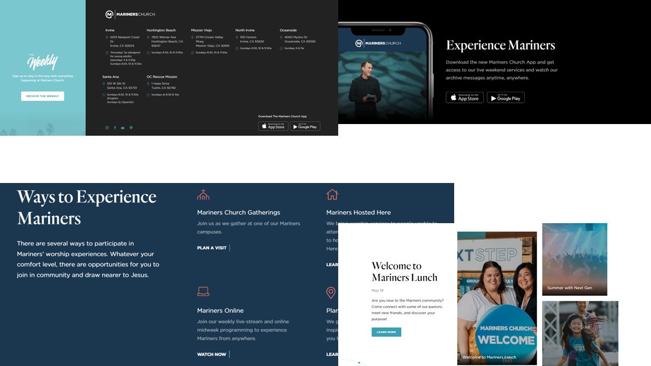
Mariners Church
HTB Church
Elevation Church
Key UX Trends Identified:
🔹 Simple, Clean Navigation – Many churches used a clear, structured menu for easy access to sermons, events, and giving.
🔹 Mobile-Optimized Layouts – Most sites were designed mobile-first, ensuring seamless browsing on all devices.
🔹 Engaging Visuals & Videos – Churches emphasized high-quality imagery and video content to create a welcoming feel.
🔹 Streamlined Event Registration – The best websites featured one-click event registration with minimal form fields.
🔹 Giving Experience Optimization – Donation pages used simple CTAs and multiple payment options to encourage contributions.
Findings & Insights:
💡 Our website needed a simplified navigation bar with easy access to livestreams and events.
💡 Implementing large, visual call-to-action buttons would improve engagement.
💡 The giving process needed streamlining—reducing steps and adding more payment options.
💡 A mobile-first approach was essential, as over 70% of users accessed the website on mobile devices.
How These Findings Shaped Our Redesign:
✅ We redesigned the homepage to highlight sermons, events, and livestreams more prominently.
✅ Navigation was simplified with clear menu items and sections.
✅ The event registration process was streamlined to reduce user friction.
✅ We used bold imagery and engaging typography to make the website feel more dynamic and inviting.
FINAL DESIGN & IMPACT


After implementing the new design, the website significantly improved in usability, accessibility, and engagement. The redesigned site now provides a seamless experience, making it easier for visitors to find information, engage with sermons, and participate in church events.
Key Improvements & Impact
📌 Enhanced User Engagement
The new visual storytelling approach (large imagery, clear typography) creates a welcoming experience.
The homepage now highlights service times, upcoming events, and a clear call to action ("I Want to Come to Church").
📌 Optimized Video & Sermon Access
The redesigned "Watch Our Messages" section provides easy access to past sermons, improving engagement with church content.
Embedded YouTube videos allow users to watch directly on the site without confusion.
📌 Clearer Navigation & Structure
The simplified menu layout allows visitors to quickly find events, services, and livestreams.
Improved button placements and CTAs increase accessibility for new visitors.
📌 Mobile-First Optimization
The fully responsive design ensures a seamless mobile experience, improving engagement.
Conclusion & Key Takeaways
✅ A visually engaging design enhances user experience and reinforces church branding.
✅ Clear call-to-actions improve engagement and guide users to relevant actions.
✅ Optimizing video content placement keeps users engaged with sermons.
✅ Mobile-first approach ensures accessibility for all users.
The new design successfully modernized the church’s online presence, ensuring that it remains an accessible and welcoming space for both members and first-time visitors. 🚀